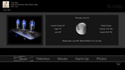
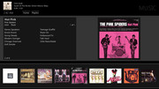
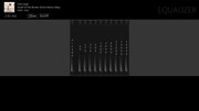
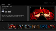
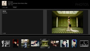
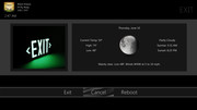
Anywho, I got bored and decided to start something different. I decided to stick to design goals that have always gotten me what I want. I've kept the darker tones for the overall theme because quite frankly I prefer them. I've also continued with integrating more data into the skin as well as fanart and such. This is what I've managed to do with a few hours a day this weekend:
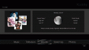

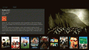
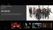
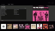
Obviously it isn't even close to finished, but as per usual I welcome feedback or ideas. It's not gimmicky at all. I'm trying to keep the layout consistent and as clean as possible. It is my intention for it to appear quite simple, but still be quite good at what it does. I'm building it from the ground up so there is no extra stuff left in it. As it is now it loads in less than 5 seconds with the fast interface option turned on, and only a second or two with the slow interface option on.
Comments, opinions, and suggestions always welcome and encouraged.

